

This is a thought experiment a little different from what I (and everyone else) usually do with alternate history, which is to change an event in the past and extrapolate outcomes, then illustrate those outcomes with a map. What I did here is start with a map. Five maps. See those little colored maps at the top? Those are based off of real maps that trace the way people communicate, trade, and live with each other, based on a lot of interesting statistical analyses (and also US census data).
Yellow is religion, or what belief system the majority of the population belongs to (not necessarily the state religion), based on this census map of religion in the US.
Orange is perceived ethnicity, based on this census map of self-identified ancestry in the US.
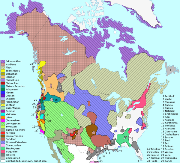
Blue is language family, based on this map of indigenous languages. Of course the brushstrokes here are very broad; and you may imagine many minority languages, extraterritorial enclaves, and dialect continua to complicate the rather simple picture.
Purple is culture, or how closely the ways of life of different people resemble each other, based on this map of how frequently people in different parts of the US communicate with each other.
Green is trade, or how much people in different places exchange goods and services, based on this map of dollar bill circulation in the US.
I traced boundaries around those geographical blocs, superimposed them, and found that some of those blocs correspond to each other. That is to say, cultural difference correlates with trade, communication, and language (I'm not convinced it correlates with religion or ethnicity, but feel free to disagree), with a lot of effect from the underlying geography (the Mississippi River, the Rockies, the Appalachians, and the North-South divide are visible in most maps). The blocks that most closely matched each other I traced around with black borders, trying to match those geographical boundaries as much as possible. The result is the big map you see above. The more different the colors, the more of a change you see going across a border.
You'll notice I haven't labelled the map. That's because this map might represent a lot of different timelines. Maybe no plagues killed off the Native American population, and we're left with a situation like post-colonial Africa ("the Democratic People's Republic of Comanche"?). Maybe this from a timeline where indigenous people domesticated horses ("The Union of Three Fires"?). Maybe European colonists came, but only with medieval technology (the Motherflippin' Gruinmarkt!). Maybe I accidentally deleted my version of photoshop, and sai doesn't do labels. Maybe I want to see what names and histories YOU think should be attached to those countries.
Come on! Let me hear 'em!
This project comes from Dan's to-be-published novel, The World's Other Side. Find out about his other projects on his website. Also find him on Twitter and Deviant art.
Isn't using data based on the U.S. census and patterns of trade and communication in the U.S, completely self-nullifying the initial premise on nation-states developed by local people instead of European colonialism and successor states?
ReplyDelete